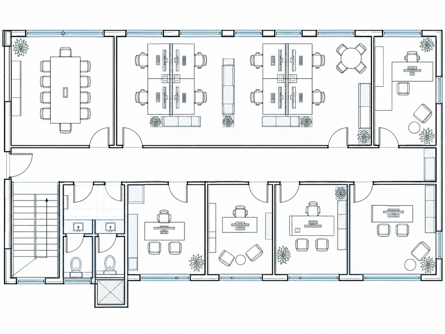
Minneapolis Skyway Map
How an interconnected city map can guide visitors through buildings, routes, entrances, and accessible connections. This detailed guide preserves the original demonstration while explaining the decisions behind a useful browser based drawing experience.
The drawing is most valuable when a visitor can move from a visible location to a clear next action. The image provides context, while hotspot content explains what the selected area means and where the related information belongs.
Understanding connected routes
Start by defining the question a user brings to this minneapolis skyway map. A person may want to locate a specific area, compare two locations, understand a route, or open a record connected to a visible object. The interface should answer that question quickly. Explain the drawing purpose before asking users to interpret symbols, and keep the first view focused on the most important geometry. This prevents a detailed technical document from becoming overwhelming when it is opened by someone who is familiar with the place but not with CAD conventions.
Separate the drawing geometry from the information displayed after selection. Geometry describes position, shape, and relationship. Supporting content can include an identifier, a plain language name, a status, a responsible team, a document link, or an instruction. Stable identifiers make the connection dependable when a label changes. Keep an untouched source drawing, document the preparation steps, and record which layers, blocks, text values, or closed regions create interactive areas.
Test the result with people who did not build the page. Ask them to complete a realistic task and observe where they hesitate. Check desktop and mobile layouts, keyboard focus, contrast, loading speed, and the behaviour of a selected hotspot. If users cannot tell what is interactive, improve the visual treatment and add a short explanation before adding more controls. A small set of accurate hotspots is more useful than a large set of uncertain regions.
Preparing a wayfinding map
Start by defining the question a user brings to this minneapolis skyway map. A person may want to locate a specific area, compare two locations, understand a route, or open a record connected to a visible object. The interface should answer that question quickly. Explain the drawing purpose before asking users to interpret symbols, and keep the first view focused on the most important geometry. This prevents a detailed technical document from becoming overwhelming when it is opened by someone who is familiar with the place but not with CAD conventions.
Separate the drawing geometry from the information displayed after selection. Geometry describes position, shape, and relationship. Supporting content can include an identifier, a plain language name, a status, a responsible team, a document link, or an instruction. Stable identifiers make the connection dependable when a label changes. Keep an untouched source drawing, document the preparation steps, and record which layers, blocks, text values, or closed regions create interactive areas.
Test the result with people who did not build the page. Ask them to complete a realistic task and observe where they hesitate. Check desktop and mobile layouts, keyboard focus, contrast, loading speed, and the behaviour of a selected hotspot. If users cannot tell what is interactive, improve the visual treatment and add a short explanation before adding more controls. A small set of accurate hotspots is more useful than a large set of uncertain regions.
Designing route interactions
Start by defining the question a user brings to this minneapolis skyway map. A person may want to locate a specific area, compare two locations, understand a route, or open a record connected to a visible object. The interface should answer that question quickly. Explain the drawing purpose before asking users to interpret symbols, and keep the first view focused on the most important geometry. This prevents a detailed technical document from becoming overwhelming when it is opened by someone who is familiar with the place but not with CAD conventions.
Separate the drawing geometry from the information displayed after selection. Geometry describes position, shape, and relationship. Supporting content can include an identifier, a plain language name, a status, a responsible team, a document link, or an instruction. Stable identifiers make the connection dependable when a label changes. Keep an untouched source drawing, document the preparation steps, and record which layers, blocks, text values, or closed regions create interactive areas.
Test the result with people who did not build the page. Ask them to complete a realistic task and observe where they hesitate. Check desktop and mobile layouts, keyboard focus, contrast, loading speed, and the behaviour of a selected hotspot. If users cannot tell what is interactive, improve the visual treatment and add a short explanation before adding more controls. A small set of accurate hotspots is more useful than a large set of uncertain regions.
Accessibility and visitor confidence
Start by defining the question a user brings to this minneapolis skyway map. A person may want to locate a specific area, compare two locations, understand a route, or open a record connected to a visible object. The interface should answer that question quickly. Explain the drawing purpose before asking users to interpret symbols, and keep the first view focused on the most important geometry. This prevents a detailed technical document from becoming overwhelming when it is opened by someone who is familiar with the place but not with CAD conventions.
Separate the drawing geometry from the information displayed after selection. Geometry describes position, shape, and relationship. Supporting content can include an identifier, a plain language name, a status, a responsible team, a document link, or an instruction. Stable identifiers make the connection dependable when a label changes. Keep an untouched source drawing, document the preparation steps, and record which layers, blocks, text values, or closed regions create interactive areas.
Test the result with people who did not build the page. Ask them to complete a realistic task and observe where they hesitate. Check desktop and mobile layouts, keyboard focus, contrast, loading speed, and the behaviour of a selected hotspot. If users cannot tell what is interactive, improve the visual treatment and add a short explanation before adding more controls. A small set of accurate hotspots is more useful than a large set of uncertain regions.
Recommendations for a production project
Start by defining the question a user brings to this minneapolis skyway map. A person may want to locate a specific area, compare two locations, understand a route, or open a record connected to a visible object. The interface should answer that question quickly. Explain the drawing purpose before asking users to interpret symbols, and keep the first view focused on the most important geometry. This prevents a detailed technical document from becoming overwhelming when it is opened by someone who is familiar with the place but not with CAD conventions.
Separate the drawing geometry from the information displayed after selection. Geometry describes position, shape, and relationship. Supporting content can include an identifier, a plain language name, a status, a responsible team, a document link, or an instruction. Stable identifiers make the connection dependable when a label changes. Keep an untouched source drawing, document the preparation steps, and record which layers, blocks, text values, or closed regions create interactive areas.
Test the result with people who did not build the page. Ask them to complete a realistic task and observe where they hesitate. Check desktop and mobile layouts, keyboard focus, contrast, loading speed, and the behaviour of a selected hotspot. If users cannot tell what is interactive, improve the visual treatment and add a short explanation before adding more controls. A small set of accurate hotspots is more useful than a large set of uncertain regions.
Using the demonstration
Use the drawing below as a visual example. The hotspot layer and supporting script show how a static image can become an interactive surface. For a production system, connect the selected identifier to an authorised data source and define how missing or outdated records are presented.
Implementation checklist
Before publication, confirm that the source drawing has an identified owner, the visible image matches the approved revision, and every interactive region has a stable identifier. Check that labels use words visitors understand, that selected areas remain visible at different zoom levels, and that an empty or unavailable record has a useful explanation. Review the page with a keyboard, a narrow viewport, and a slower connection. Finally, record the conversion settings and the date of approval so the next update can be compared with the current result.
A detailed drawing page should teach the visitor how to use it without requiring a separate manual. Include a short introduction, a legend or explanation where needed, and a clear way to return to the demo list. Keep technical notes available for maintainers, but place user-facing instructions next to the task they support. This balance makes the page useful to a first-time visitor while preserving enough detail for the team that will maintain the drawing.
Use the checklist again whenever the drawing, hotspot rule, or connected data source changes.